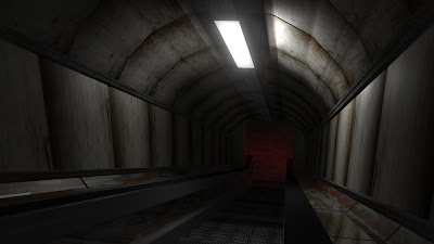
Here's the basic Maya scene without any Photoshop work done to do. I've done some heavy re-texturing in order to make it look a more aged and dirty. I've also dimmed the light somewhat and added an ominous red glow beyond the archway below. I hope to insert my framed posters in the foreground lining the walls as my matte painting if that would be viable.
Admittedly, the previous version did seem very rushed. I guess that was because I wanted to focus more on my essay. However, I've knuckled down and tried to implement more detail into my Maya scene. Some critique would be most welcome!


Hey Tom - I think you need to release your inner lighting designer; you're still managing to make this seem very bland somehow. I think you may want to consider your colour temperatures a bit - a whiff of Suspiria wouldn't go a-miss. I'm no expert admittedly, but your textures on the walls seem very stretched, and in terms of their specularity, they're not reacting to the light - there's no shine or any real sense of the material from which they're fabricated. Maybe some real world distressing of your surfaces would help - you know, graffiti, tags, stickers, grime etc? I think you need to go back to the real world and take some references into the software.
ReplyDeleteHi, I definitely think it's morre effective with the light at the bottom, but agree - the textures on the walls don't look quite somehow...also, have you re-shaped the walls to fit the posters, rather than attempting to get the posters to fit on the walls?? They had a pleasing curve before... And again, I agree with Phil - the atmosphere in your concept art came from the fact the posters were torn and ragged, so I think by making them framed and neat, you lose a lot of the tension.
ReplyDeleteTom I think the stretched textures on the walls might be a result of something similar to what I faced, did you uv map that whole wall in one go? You might find the textures will sit better if you uv map the walls in sections, doesn't take much longer and is definately worth it!
ReplyDeleteAlso from what Phil is saying the walls are not shiny/reflective enough, did you make specular maps like the bumps maps for the walls? If you did you might want to up the contrast/brightness to exaggerate the shine some more :)